
Observing the Observer: OTel Collector Dashboards Done Right
Almost every platform or observability team has stood up an OTel Collector, watched spans flow cleanly through staging, and shipped it, only to find silent export failures, dropped logs, or a growing queue backlog sometime in the first week of real traffic.
Not because anyone was careless, but because "data is flowing" and "the pipeline is observable" are genuinely different bars, and most teams never build the visibility to know which one they're actually at.
This post is a concrete guide to building a dashboard that tells you the truth about your OTel Collector, covering the right metrics, query design decisions, and layout principles that make the difference between a dashboard that looks fine and one that's actually useful at 3am.
The context throughout: a Collector receiving from OTLP endpoints, processing through multiple components, and exporting to Datadog (primary) and S3 (archive).
Get Your Queries Right First
Dashboard panels are only as trustworthy as the queries behind them. Two tiny decisions made wrong here will silently undermine everything else.
sum vs avg: For throughput metrics, received, sent, and failed, always use sum by. You want total volume across all Collector instances. avg silently undercounts in any scaled-out deployment and makes your pipeline look quieter than it is. The only place avg makes sense is resource metrics like CPU or memory per instance.
count vs rate: Use .as_rate(). Received, sent, and failed are monotonic counters, and rate normalises them per second for a consistent throughput view regardless of query interval.
Beyond those two: use default_zero to prevent misleading gaps, scope every query with \(env and \)collector_instance template variables, and keep rollup windows consistent across side-by-side panels. Mismatched rollups make drops look larger or smaller than they actually are.
What Actually Matters to Monitor
The Collector emits a lot of metrics. Most of them are noise at 3am. These are the ones that matter.
Throughput is your baseline: otelcol_receiver_accepted_* vs otelcol_exporter_sent_* per signal type. If those two numbers diverge, something in between is eating data.
Data loss is your critical surface: receiver_refused_*, exporter_failed_*, and exporter_enqueue_failed_*. These should be zero. Always. Alert on anything that isn't.
Queue depth is your early warning: queue size against capacity tells you whether the exporter is keeping up. Alert at 80% utilisation, not 100%, because by then you're already losing data.
Processor metrics worth watching: the batch processor's timeout vs size trigger ratio (high timeout ratio means data is sitting waiting), and batch_metadata_cardinality (high cardinality causes memory bloat that eventually triggers the memory limiter). If you're running tail sampling, sampling_decision_latency can become a pipeline stall that shows up nowhere else.
Layout: Top-Down by Urgency
The structure follows one principle: top rows answer "is data being lost?", middle rows answer "where and why?", the bottom row answers "is the Collector itself healthy?". You should be able to call the pipeline healthy or broken from the top section alone.
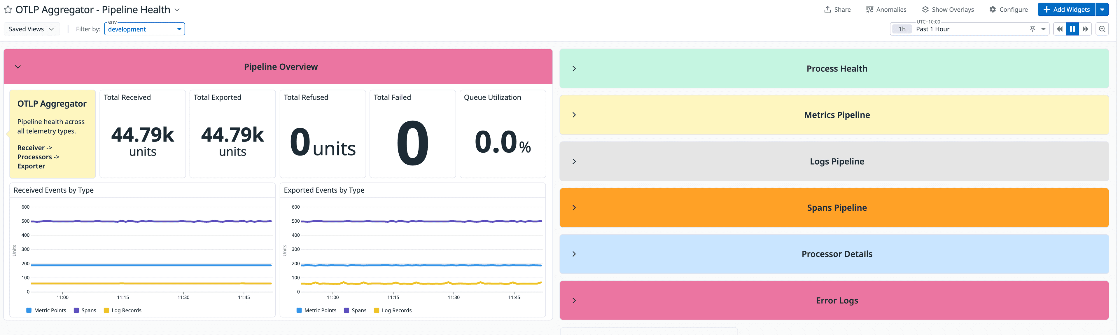
Pipeline Overview is fully aggregated with no splitting. Scorecards for Total Received, Exported, Refused, Failed, and Queue Utilisation %. Add conditional colour thresholds to Queue Utilisation (green below 50%, amber to 80%, red above) so it communicates status without requiring interpretation. This row should be boring on a good day.
Per-Signal Pipelines give Spans, Metrics, and Logs each their own collapsible section: scorecards plus a Received vs Exported time series plus a separate Refused and Failed panel. A few details that matter: add a % exported ratio scorecard ("99.8% exported" is more readable than mentally comparing two large numbers), use contrasting line styles for received vs exported so divergence is visible before you check the legend, and ensure Refused/Failed panels auto-scale from zero rather than sitting on a fixed axis that makes every flat line look identical. For Logs specifically, split by receiver tag, since log sources are more varied and source-specific failures hide easily in an aggregate.
Processor Funnel shows volume at each processor stage in order. This is the single panel that makes data loss immediately locatable. Show dropped items as positive values, since negative numbers require a mental inversion that costs time you don't have. Document each processor's purpose in a text widget; anyone unfamiliar with the pipeline will thank you.
Exporter Health by Destination treats Datadog and S3 as what they are: two exporters with different criticality. Datadog failures should page immediately. S3 failures are silent today but permanent, since data loss in an archive is unrecoverable. Show them separately. Tag exporters with criticality:primary vs criticality:archive via the transform processor so alert queries don't hardcode exporter names and break the next time the pipeline changes.
Latency Proxies exist because the Collector has no native end-to-end latency metric. Approximate it with queue depth over time (growing queue means growing latency) and the batch timeout trigger ratio (high timeout ratio means data is sitting waiting). For teams with actual SLOs, invest in a synthetic heartbeat, a known span sent through the real pipeline at regular intervals with a known emission timestamp, measured on arrival at Datadog. It's the only way to get true wall clock latency across every stage without custom instrumentation.
Process Health covers Memory RSS, CPU (in percentage or millicores, not raw units), and Go heap allocation, which is spiky due to GC. Correlate with go_gc_duration_seconds to confirm it's GC and not a leak. This section lives at the bottom because it's context, not your primary signal.
The Gaps That Will Hurt You First
Silent data loss between a receiver and exporter with no visibility into which processor caused it. An S3 export failing for three days before anyone notices because it's aggregated with Datadog. Queue saturation that looks like a healthy flat line because the panel's y-axis was never configured. A Logs pipeline spiking from a single source that's invisible in an aggregate view.
None of these are exotic failure modes. They're the ones that happen first.
A dashboard that makes them visible in under 30 seconds isn't a nice-to-have. It's the difference between an incident that gets caught in minutes and one that becomes a week-long data gap in your archive.